Today’s tip (and thanks for waiting, by the way) is about drawing and painting what you ACTUALLY see, not what you THINK you’re seeing.
I’d love to encourage you to draw your kids, their toys, your pets… someone or something close to you – and certainly that would be MY goal for you. Wouldn’t you love to have a drawing of you as a child, by your parent or grandparent? Would you care if it wasn’t perfect? (Would you even notice?!) But most of those subjects have opinions, or you have very high expectations of yourself to create a true likeness.
So, if you’re a beginner, I’d really recommend starting with something like a flower, or even food – because they are subjects that really won’t mind if it doesn’t look EXACTLY right!
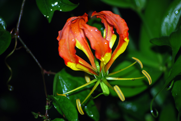
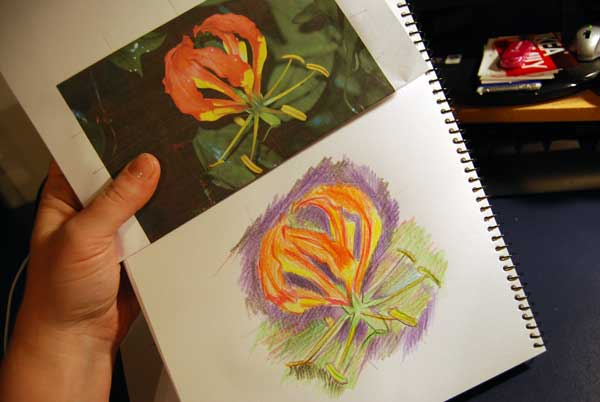
Now, to explain what I’m talking about today, here’s a starting photo of a flower from my Mum’s garden. It’s got an interesting shape, and that’s what I’m looking for today.
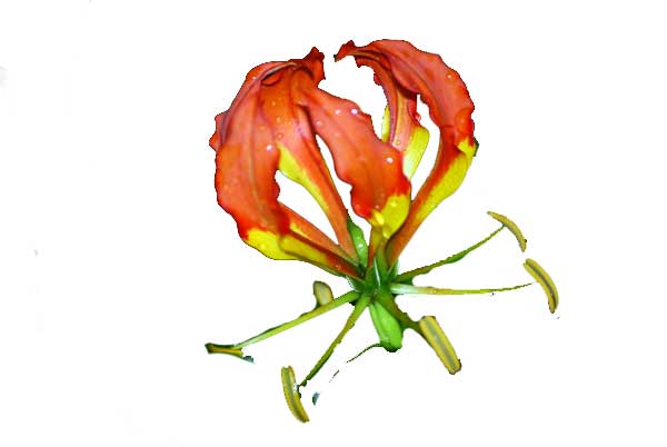
Now, here’s what your mind is probably seeing as the flower… that is, what you think you had to draw. It’s an arrangement of petals and stamens, in varying colours…
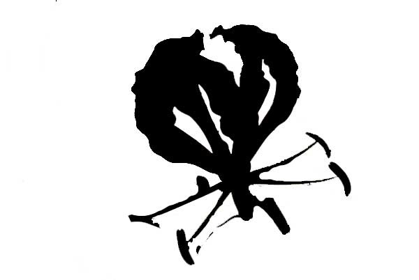
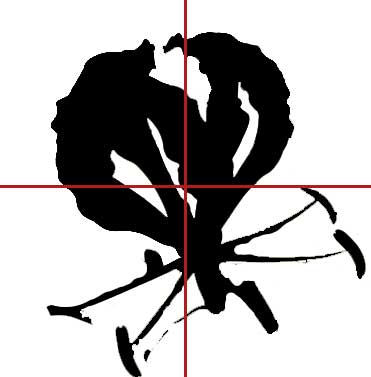
But I’d like to encourage you to see this instead…
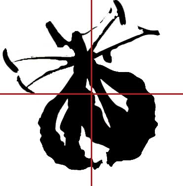
And once you can see the ‘thing’ as a shape instead, whack on a quick grid…
… and then turn it upside down.
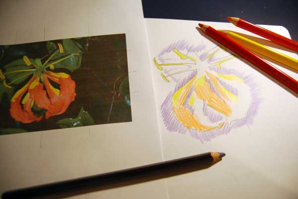
Now you’ve got the proportions of your composition right (or at least they’re a lot closer to being right that they would have been if you’d just gone ahead and drawn ‘the flower that your brain saw’). Then refer back to the original photo to fill in the most important details… (stay loose, the world doesn’t need an exact duplication – we’ve already got a photo!)
What next?
Start shading in the background darks (
don’t use black!) and inside colours – keep thinking of them as shapes, relative in size and shape to the other things around them.
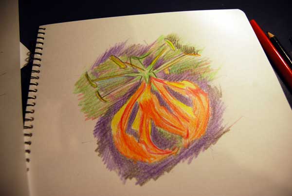
Then think of tonal variation – make your dark areas darker, which will naturally make your light areas appear lighter! Just push a bit harder on the pencil, or ‘crosshatch’ which simply means, sketching lines in the opposite direction so that they ‘cross’ – that’ll make things darker too.
You don’t have to have special pencils for an exercise like this – I used a box of “Jumbo Triangle Colourfun Pencils” (I like to have a go with them before I share them with the kids). But of course, if you’re using basic colours, they may not have much of a selection. So use the
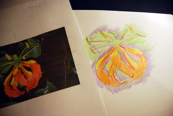
COMPLIMENTARY COLOUR (opposite on the colour wheel) to ‘grey back’ any brights that are too bright. For example, here I have shaded some red over the bright green in the background, so it appears a little more natural and is a different colour to the green of the stamens.

Keep on filling in any areas that need more definition,
then turn it right side up… and there you have it! A flower that looks a lot more like it should, than if you’d just ‘drawn a flower’.
If you want to learn more about this method, I highly recommend the classic drawing book “Drawing on the Right Side of the Brain” by Betty Edwards. She describes in depth just why things don’t look the same when they are upside down. I mentally turn shapes upside down when I’m doing precise calligraphy, and ALWAYS do it when I’m drawing or painting faces that need to be recognisable.
And the best bit is turning it right-way-up at the end.
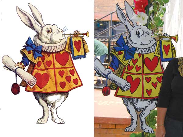
This is the exact technique I used to paint this rabbit on cardboard that we used at our school Race Day last Saturday.
I’ll show how I do this with faces in a future Art Tip.
What are you going to try drawing now???
