Colour is one of the joys of my life.
But in this episode I’ll tell you what I believe is more important, and how to use it to improve your drawings and paintings.
Transcript
This is episode 12 of the Art Fit Podcast. Hello, I’m Anna Battle, Shiny Happy Artist and your host of the Art Fit Podcast. Now, just as physical fitness is good for your body, Art Fitness is good for your mind. And you don’t need to be an Olympics level professional artist to benefit from Art Fitness. But what is the point? How do you actually do it? How do you fit it all in? Well, I’m on a mission to help you get Art Fit.
This podcast is brought to you by my Shiny Happy Art Club. I send you a brand new high quality guided Paint Along each month, in acrylic and watercolour, as part of a lovely group of art friends from around the world. So, you can become a Shiny Happy Artist and get Art Fit.
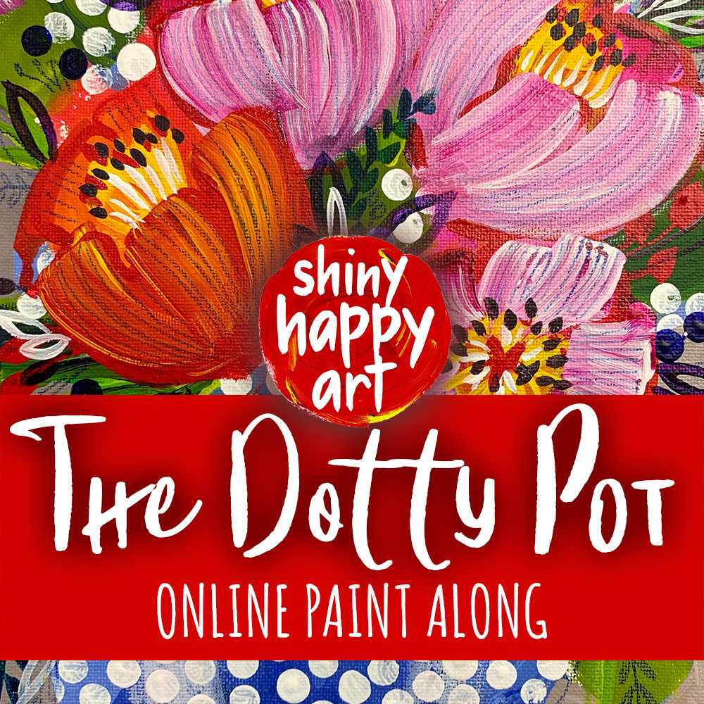
Okay. So, episode 12, it must be time to get a little bit controversial, shall we? And what I’m going to say is, that I believe that tones are more important than colours. And I don’t think I’m the only one, actually. So, maybe it’s not too controversial but I love colour. I absolutely love colour, in every aspect of my life, and particularly when it comes to painting. I think, I love painting flowers because I’m allowed to play with colour. When it comes to flowers, they’re a terrific way to experiment and enjoy rich, rich colour. So, colour is wonderful, but colour does have what’s called a value. And this is… The way I like to explain it, is if you take a photo of a colour, it will come, and then turn it into black and white. So, you’ve got a monotone photo of a colour; it will read as a shade of grey. So, yellow will be a light grey; dark green will come up as nearly black; a mid-blue will be a mid-grey. Okay?
So, you can use your own phone to do this. And with an iPhone, you can choose the monotone of the monochrome, I think it is filter. Now it is monotone; that’s right. There’s 3 different black and white filters on my own phone, at the moment. Of course, that changes. But if you have a different phone, please just google, if you don’t know how to find the filters because this is such a fabulous resource, if you are sketching or painting, when it comes to judging your tones. Because you may often get to the end of a picture and go, “Ah! That’s not that impressive. What have I done?” You can’t quite put your finger on it. but a terrific way of, sort of, self-editing or self-judging, critiquing the drawing or the painting that you’ve done, is to get out your phone, set it to monotone and see if your picture looks good in shades of grey. Because if it does still look good in shades of grey, well, then you’re done; you’ve finished that picture. It’s time to move away. Let’s step away from the canvas or the sketchbook, and have a break or move on to the next one. But if it looks good in shades of grey, that is a really good way to figure out that you’ve resolved that painting or drawing.
If it doesn’t look good in shades of grey, then that gives you an opportunity to think, what am I missing? So, it might be the depth; you might not have enough darks on there that show where the petals are sort of pulling away, and down into the centre of the flower. There might be shadows underneath the petals that you haven’t included in there. It gives you the opportunity to see things again. By the same token, if you’ve gone in and not put any highlights on, then you have everything pretty dark; that can be a pretty boring picture too. So, just consider, if you’re going to add some highlights into there, and how you can do that. If you’ve gone with watercolours, it’s a bit harder to do but, by the way, look, you can get any paint out and add it to the watercolours. If you’re not entering a watercolour competition and this is your sketchbook, once again, I’m giving you the freedom to use some mixed media there; bring in something else.
My mum is a wonderful artist. Diana Battle Artist; you should follow her. She often will cut out or tear up pieces of coloured paper, or cut like she’s painted them, and she’ll place them around her paintings, to give an idea of where colours could be changed. So, she’s actually physically, it’s all like collage, like temporary collage to decide how the colours will work. But it’s such a really good way to use your phone. It’s a wonderful resource. It’s not cheating; it is using something that is available to us. At the moment, these days, most people have that access to a phone that can look at it through a monotone filter. So, keep that up your sleeve because that is a terrific way to judge your tones. And it means that your colours, if they’re not spot on, they can still work. And there are so many artists who use super bright colours or quite neutral colours, and it still works. Okay? That’s because their tones are fantastic. By the same token, there are people who will use a lot of dark colours, and it’s like, you know, something’s not quite right about it but you can’t quite put your finger on it, and that might just be because of the tones. You don’t need to have an equal amount of each tone, but a little bit of each at least, is a really good way of starting out, especially as a beginner, when you want to impress yourself. Okay, so there you go. I’ve said it; tones are more important than colours. Do look at different colours through your phone and see what the shades of grey are. And as you file away that knowledge, it will make you a more confident painter. So, go ahead and do that; that’s a really important skill to learn, when you’re trying to get Art Fit.
So, you want to get Art Fit? We’ll find out when the doors to the Shiny Happy Art Club open next. There are 24 online Paint Alongs to choose from when you join, so you’ll definitely find something you love. And now, there are also $15 and $25 subscription options. So, go to www.shinyhappyart.com to pop your name on the waiting list. I look forward to painting with you in the Shiny Happy Art Club. And until then, I’ll be back in your ears with the next episode of the Art Fit Podcast.


